معلومات عنا
دعم العملاء
احصل على التطبيق

قم بتوجيه الكاميرا لتنزيل التطبيق
حقوق الطبع والنشر © 2024 Desertcart Holdings Limited
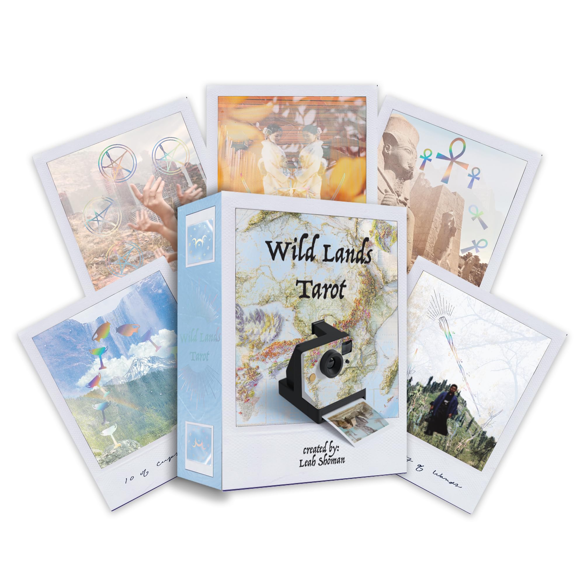


Wild Lands Tarot: Roam the lands and ancient wisdom will be revealed (78 Full-Color Cards and 96-Page Guidebook)
J**E
Gorgeous deck
Gives great readings
S**A
Wow
UPDATE: So I just wanted to update.... I know I said I didn't love the card stock - I take that back. I spilled an entire mug of hot coffee all over my desk, was so happy that it didn't touch my cards. A couple hours later I noticed a huge splat of coffee over my 9 of cups. It wiped clean off and didn't seep through the card at all!!! There's no damage to the card after having hot coffee on it for a couple hours, I'm shook!!This is my favorite deck now. The imagery is extremely beautiful and striking. The card material is a little difficult for me to work with personally, it's more paper-like than card-like. But I think this was well worth the purchase
C**S
My favorite deck
I love the images from different lands. The concept is wonderful. The cards are not as colorful as shown online, but they look faded as if they were actually from a Polaroid picture, which adds to their appeal.At first, I was thrown by the addition of Ankhs, but the more I consider their symbolism, the more their energy makes sense.The book is extremely small and hard to read, and could be an issue for some people.
E**N
Such a beautifully layered deck!
Loving the imagery and energy coming from this super creative tarot deck! The sword suit as ankh is interesting and makes me realized how the true ankh embodiment is connected to clearing the mental patterns! I also love the travel photography approach and how the visuals are multiple exposures and polaroid reminiscent. The high quality of the printing is beautiful, durable, long lasting and well crafted! Would definitely recommend this deck and its vibe!
A**Y
So gorgeous!
I love this deck so much! The colours, the images and the messages within! So unique and the best quality. I use these everyday!
H**T
Unusable (images not connected to tarot meanings) and unreadable booklet
While a neat concept, this deck isn’t really usable. The photo images aren’t connected to the card meaning and the full justification in the booklet makes it unreadable. The booklet meanings are generic and don’t connect to the image either. This is a waste of money.
J**T
What an original idea!
This deck gets 5 stars from me just for its uniqueness. Each card looks like a Polaroid photo. There are lovely soft pictures in the background with a silver overlay of the cups, wands, etc. The overlay flashes in rainbow colours when the light hits them and the names of the cards are hand -written just like you would label a photo! The card stock is soft and matte and I would guess it would be quite durable. The book is in very small print and that is my only issue so u may need a magnifier, or you may not. But I just can’t wait to read with them and for anyone who likes cards that are different, this IS your next deck purchase. Also a great collectible deck.
O**A
Bellisime
Belle e delicate di ottima qualità....da collezione
T**N
Lovely Polaroid-style deck ✨
The media could not be loaded. This is one of those decks that just hits differently in person, yes it looks lovely in photos and videos, but there is something special about actually holding this deck in your hands.I will admit, I initially found the multi-layered images, with their double exposure effect a bit weird, but the more I work with this deck, the more I understand why Leah chose to illustrate her cards in this way, and printing them as Polaroids was the perfect way of presenting these images.The photography and holographic foil is designed to activate the user's pineal gland and allow the transmission of light codes, and while I appreciate this might be a bit too "woo" for some people, as someone who does work with light codes I love this aspect of these cards. Of course, if that's not your thing, you can just treat them as any other tarot deck if you wish.The only big change from the "standard" tarot structure is that the suit of swords is now Ankhs, and the photography for that suit is primarily from Egypt. I don't know why that suit name was changed, if the guidebook explains I've managed to miss it, but I've no problem with that personally. I mention it only because I know some people care about that sort of thing.The guidebook itself is full colour, with each card being given its own page containing keywords, the location of the photograph(s), and interpretation. The text layout might annoy some people, with large spaces between some words, and some words being stretched out across the whole paragraph length. I'm not sure if this was a stylistic choice, but given the words most affected, it's definitely a possibility. It has forced my brain to slow down to be able to read the descriptions, so maybe it was intended.There is a lovely five card guidance spread in the guidebook, and you can see my card pulls in one of these photos. The messages I've received from this deck so far have been kind and helpful, which I appreciate because I already have plenty of sassy decks 🤣
う**ん
とっても気に入ってます
動画で見てから探しまくってました。やっと手に入れる事が出来ました。写真とホログラムの組み合わせ。イメージが湧きます
M**M
Absolutely beautiful
This is such a beautiful deck, my only criticism of that even though the guide book is very insightful, the print is very small and difficult to read. There’s very strange word spacing in some bits. I love the deck though, such an original concept.
ترست بايلوت
منذ يوم واحد
منذ شهرين