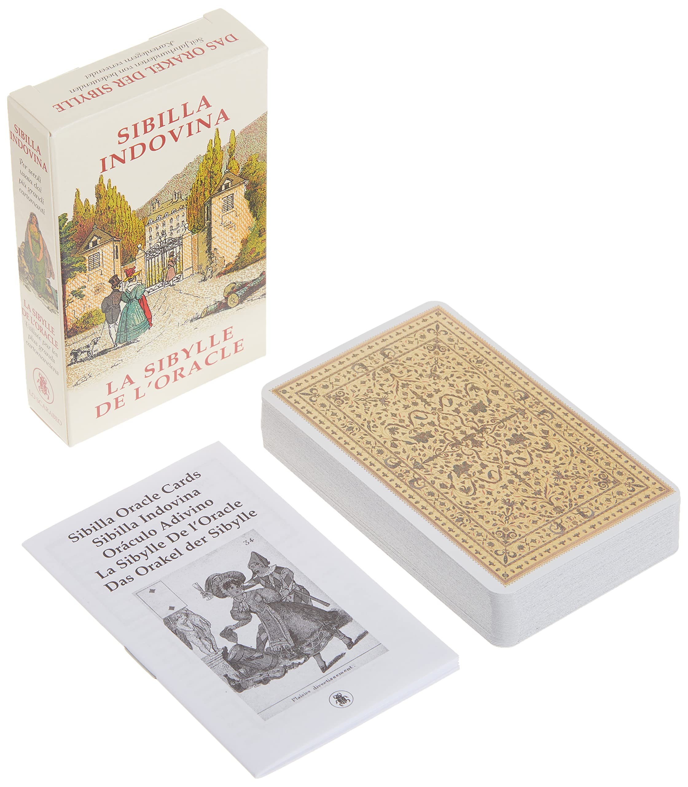

Full description not available


A**O
Decent Price for the Deck Quality
Can’t beat the price when it comes to the quality. Some of the cards are mistranslated like infantilism card in the French word when translated is the word Sorrow but other than that I do recommend if you have been eyeing this deck.
J**R
beautiful find
I am so glad I came across these wonderful cards I only wish they had more information. Originally, I saw them in a much bigger size these are the size of a deck of reg playing cards which is fine and expected if anyone has info on more specific interpetations for this deck please post. I do have to admit it does make you push to develop your intuition and I had been seeking that. Terrific add to my collection.
A**M
Recommended!!
Beautiful cards very nice quality and they are easy to shuffle .. Thanks to Amazon for amazing service to let itReach to me in this good condition.
C**
Nice deck, but wish the introduction booklet were better.
The cards are beautiful and easy to handle. The cards have the title of the card in different languages at the bottom and corners of each card. My only irritation is about the incredibly brief book that offers no instructions about the cards’ meaning. There are no instructions about how to combine the cards. This is a pity for someone new to this oracle. The cards are simply labeled “Pensioner,” “ Hope,” “Angry woman,” etc. It’s just that there are zero ideas of what the cards traditionally mean nor how to combine cards. I’ve looked online for information about the cards’ meanings. Yet there are hardly any in the English language. There are a few in Italian and the meanings are more involved than the titles of the cards suggest. So “ Old woman,” means more than just encountering an older woman. The “Hope,” card has several nuanced meanings that go way beyond the title of the card. So, I love the artistry of the deck but regret that there isn’t a good booklet that schools new users into this unknown (in the USA) art. A deck with a clear booklet that tells us all the meanings of the cards and how the individual meanings of the cards change once combined, would lift the deck and make it more accessible to new users of this interesting art.
N**W
Fun Cards!
If you are just starting to learn card reading, these cards are easier to learn compared to Tarot.Great for developing your intuition. And the "Angry Woman" card never fails to make me laugh!If you already know Lenormand, these will be easy for you to read. However, they are differentfrom Lenormand and "speak" differently. They make a great addition to any card reader collection, andthey are made of good quality card stock and shuffle nicely.
M**N
Great Deck with Excellent Graphics and Quality
I’ve had these cards for years and gave my deck to a friend. His fascination with the cards rekindled my interest in the cards so I purchased a new deck. Excellent multi-use cards.
J**
Me gusta
Para mi gusto es muy pequeño aunque bonito
G**L
Disappointed with imagery
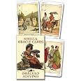
Having recently fallen in love with the Gypsy Oracle Cards and the Everyday Oracle, I was curious about other Sibilla decks and came across this one. The subtle color palette appealed to me, as well as the French titles (they are also given in other languages including English). However, upon receiving them I immediately realized they will be, for me, unusable.Why? The first glaring reason is the "Presents" card or 9 of Clubs, which features an obviously affluent elderly white man bearing a gift, followed by a black man, clearly a servant, carrying his packages. I couldn't possibly use this card with clients, nor even myself. I realize it's a historical deck from the past but it's just too jarring an image. The servant is the only person of color in the deck.My other reason is the sheer ugliness of most of the human figures in this deck. They seem to have been intentionally drawn that way, with elongated heads and, to me, grotesque expressions. There are definite exceptions, of course. And for some cards, of course, the face as drawn is appropriate. But they're just not nice to look at. I did Google the images before buying, but did not see the "Presents" card, and the card images I did see were too small to notice the faces in detail.Others might have a completely different take on this; these are obviously popular cards and highly regarded. They're just not for me. They also have tiny print. They'd be much improved if they were enlarged and made borderless; the white border on an already light card makes them look washed-out and forces the image itself to be reduced in size.
ترست بايلوت
منذ أسبوع
منذ أسبوعين