
Anatomy of Type
G**N
Nice
Nice
R**K
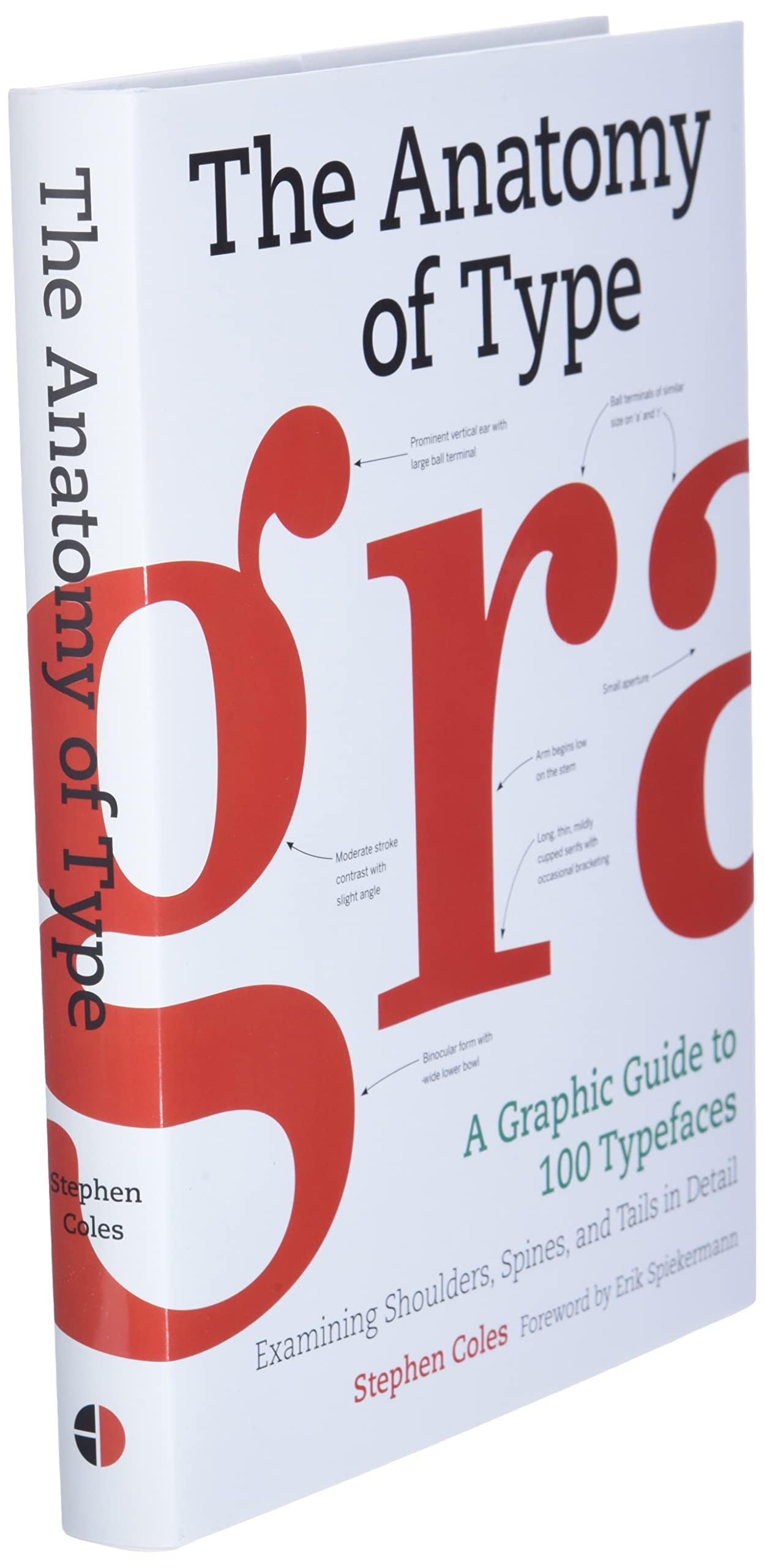
Anatomy of Type Not Explained in Detail
The author should have devoted more real-estate (instead of just a single spread) on the actual Anatomy of Type & Typographical terms itself instead of discussing so many Typefaces & trying to only make the book visually appealing. It would have been really helpful to have dived deep and tell us how each of these terms, e.g., aperture or ascender or bowl affect how we perceive type and the pros and cons of each of these features.
R**J
No details on Anatomy of Type
The book print is great but not worth. It doesn't cover the basics of Type. No valuable content, just the typeface with 2 lines of history. Waste of money.
C**R
How to pick a typeface
This book is really great for showing major typefaces and how they vary. I like that the entire alphabet (upper and lower-case), numbers, and some symbols are shown for each face. Then, there are huge examples of letters that show the unique characteristics of each face. I find it very helpful in guiding me with the typefaces I have on my computer. I now know better what I should look for when picking a typeface for a specific purpose.
M**M
best!
this book bring with many examples of types and form of letters, quality and so recomendable, if you want to learn more about types, this is the book!!
L**S
muito bom
este é um ótimo livro, adorei minha aquisição, muito obrigado a t o d o s o s e n v o l v i d o s
C**N
Libro para consultas tipográficas muy recomendable
El pedido llegó muy rápido y en perfecto estado. Un libro de referencia muy interesante para todo aquel que se adentre por primera vez en el mundo de las tipografías.
S**S
Great and useful book.
What I like:Every time I open this book I learn and see something new about the fonts. This book definetively helped me to see typeface design in a closer and more detailed way.Despite nowadays there are several enemies of type classifications it is very illustrative to see the different and punctuated classifications proposed. The book doesn't aim to enclose families in pigeonholes as it acknowledges that limits between styles may be very diffuse and one single typeface can gather features from very different places of the type universe and distant moments of history. As type designer it's important to understand how consistent or varied can be an alphabet, what matters is to know where and why every applied feature comes from.What I think could improve:The description about the fonts could be deeper and more objective in some cases. However suggesting in wich contexts they work better is a very good idea.It would be great to have a deeper view to italic variants of the choosen fonts and how their anatomies change across the proposed classificaton as well. Also, I would like that script fonts were analyzed in the wide way they did with romans, but I guess that's material for a different book.My conclusion:A great and useful book for typeface and graphic designers. I'm very happy for purchasing it. Despite what I mentioned it deserves 5 stars as it shows the author did an awesome job researching, selecting and comparing the fonts.(Sorry if my English is not clear or inaccurate, I did my best)
ترست بايلوت
منذ 3 أسابيع
منذ 5 أيام