✨ Elevate your card game with a touch of gold!
The Bicycle Gold Deck by US Playing Cards combines elegance and functionality, featuring a standard size and premium quality finish, making it perfect for both casual play and professional performances.
D**D
Another must for collectors. And yes, these are the originals.
Another hit by Elite. And contrary to what a one-star reviewer has been claiming, these are original, not a cheap knock-off. The original price for these decks was $10, as can be seen on the Kickstarter page for them, an other decks they've created. The Elite page itself lists the remaining decks they have in the $5 to $11 range as well, and all their other decks are similarly priced in the same ranges, as you can see on their other Kickstarter projects. I suspect he's just angry that he got suckered into paying over $50 for his deck by some other seller. This is common; I've found other decks that most sellers have listed for under $15, yet a few are offering the same thing for several times that. Elite's Elegance deck, for example, is listed by various sellers, priced from $20 to $100 a deck. They're the same decks, but as the stock runs low, some sellers will hike the price way up. Look around before falling for that.His claim that the lack of a bar code proves these are fakes and that there's an original deck with a bar code are dead wrong. A bar code appeared on the preproduction artwork only, and never made it to press. If you go to the Kickstarter page for this deck and read through the more recent comments there, you'll find photos of the very first decks they received. Obviously these would be from the first, and only print run of the decks, and some of the photos show the bottom of the box, revealing there is no bar code there. ll the images for this listing are from the preproduction art, used for the Kickstarter, before any decks were printed; they're not photos, they're CG renderings.And no, the original preproduction bar code, and the code on some of their other decks, are not UPC codes; they're fun, tongue-cheek jokes. Their Excellence deck has the bar code "3XC3113NC3" and their One Million deck has the bar code "1000000". They originally had one that read 2OFCLUBS, which only appeared in the preproduction art. I'll also point out that these bar codes are not exactly valid, both of those decks have the exact same bar patterns, as did the original artwork for this one.Elite also planned to do an embossed box, if their funding reached $80,000, but it fell short. Thus, there are no embossed boxes for these, and there never were. The box does have a subtle printed design in the black areas that looks like embossing, which would have been completely lost if these were copies.If there were fakes of these, then it would be mentioned on at least one of the various card collector forums. There is nothing to be found there.Ok, enough of that...Starting with the beautiful box, which is coated in a semi-gloss black, is the Ace of Space design in gold foil. A print of the back is printed in the same metallic gold ink that is used on the cards. I wouldn't call it a rich gold and it's more of dull bronze, and the metallic nature is subtle. The seal is black with a gold print of the spade as well. Mine didn't peel without ripping in half, unfortunately. I will point out that the product images on this listing are renderings, made before the deck went to press; they are not photos. The actual back of the box is not as vibrant as it appears in those images; metallic inks cannot shine quite like that. The spade pip on the back, however, IS printed in gold foil, as are the line art borders; it's just the back design that's printed in the duller metallic ink. There's a subtle faux embossing printed in the black areas of the front and back of the box. As I pointed out above, Elite hoped to do an embossed box for this deck, but their funding fell short of that goal (just barely).Now the cards... The backs are a full bleed metallic bronze, with a black print of the design on top. The gold-bronze border is quite thin, and on my deck, is slightly off center; a problem with thin borders like these is they show misalignments like this more readily. The back is also a one-way back, but it's extremely subtle, and possibly unintentional. Again, the preproduction art makes it look like the backs are foil stamped, but they aren't. Foil stamping on cards is a tricky process, and tends to chip and peel fairly readily with use. Bicycle has just recently worked out a method to do this this year, but it's expensive; they sell their own decks for $20 to $30 a deck. It's safe to assume that decks like this one would end up costing a fair bit more to use that process, but I do look forward to them.The faces all have a very light design in their backgrounds, so none of the cards is actually white. They all have a flourished frame design in a yellow-brown gradient. There are two Jokers, one a mirror image of the other, with the full body Joker character playing a double flute.The gold-brown gradient is visible on the pips of the black cards and in the backgrounds of the face cards, which keep their designs within the flourished frame. The red suits have a red-black gradient on each pip, and their face cards contain more red in their color schemes.Like other Elite decks, they modified the arrangement of the pips for the 7's and 8's, making the arrangement more symmetric.There are two additional cards; the brand card, and a 'blank' face, which only has the frame and background.These are printed on high quality Aristocrat stock, which is slightly thinner than standard Bicycle stock.Since the boxes for these are coated in a slight gloss, they're slightly water resistant, on the outside. Still, take care to avoid getting them wet. I keep mine in the original cellophane wrap, like the other Elite decks I own.All said, these are another must for collectors.
G**E
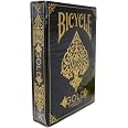
The box is pretty
The box is pretty. The cards are a great quality (bicycle). Was hoping the cards were a darker color on the front.
D**O
Purchased for a Gambit costume
Unfortunately, I had to destroy a few cards from the deck to make these props, but boy did they turn out utterly fantastic.
C**I
Nothing special.
the vivid pigmentation and colors depicted in the product photos are sadly misleading. After seeing the product in person the card faces are incredibly dim in comparison. Just be aware the colors are not as vibrant as the image displayed on the screen but they certainly get the job done.
A**A
... i was expecting cheap paper deck but i really like them. The texture is the same with other ...
I bought theses cards for the basic use of just having them and I can say that i was expecting cheap paper deck but i really like them. The texture is the same with other Bicycle cards and they are detailed very beautifully. The only con is that it does not shine like in the image sorry.
J**C
Great for decoration but not for playing.
I bought these cards for a casino themed centerpiece and for that purpose, they worked swimmingly. They are very beautiful cards, a little smaller than an average sized deck and not something that I, personally, would be comfortable playing with. Not as easy to read as a white background where contrast between suits and background is sharper. But that should not detract from rating because they are very beautiful and, as described/pictured. Just not my cup of tea for a night of gaming.
M**N
Best
I bought this set of cards for spades and they were so great somebody stole them from my house smh.Never the less they were great cards and fun to look at while playing.
R**H
Not for playing with
-Very cool look. Quality feel.-In regular use something in the ink or coating begins to leave little dots. They can be rubbed off but quickly return. No, it is not from our dirty hands or table. This is not the only deck of cards we own.-Shuffling reveals a weakness in the lamination that I didn’t expect. They feel nice and durable but do not withstand regular use in comparison to the average Cycle brand.-The artwork is nice. But again, in regular use they are not quickly distinguished from each other. The “antiquing” mutes the contrast down too much. Combined with the busy design you better pay close attention.
Trustpilot
3 weeks ago
2 months ago